How did you use new media technologies in the construction and research, planning and evaluation stages?
Blogger
Prezi
Final Cut express
Photoshop
Youtube
google
dafont
2417 Rachel Marshall
Tuesday, 7 December 2010
Monday, 6 December 2010
Evaluation question 1
In what ways does your media product use, develop or challenge forms and conventions of real media products ?
Tuesday, 16 November 2010
Magazine
Poster
First poster draft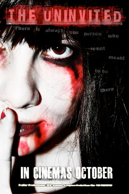
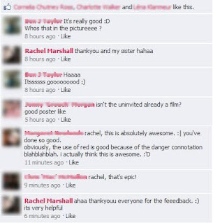
Feedback on Poster
I posted my Poster onto facebook because i wanted to gain feedback for it and generally finding out weather it does look like a horror poster or not. The feedback i gained is positive therefore i am going to leave my poster as it is because i think it meets all the general elements of a generic horror poster.
Here is the feedback that I gained from facebook.

images for poster
Friday, 5 November 2010
images for magazine
I have changed the name of my magazine from "SPOOK" to "Killer Film" i have done this because i think "spook" sounded tacky, and common whereas killer film is a bit more formal and i can use more effects with it.

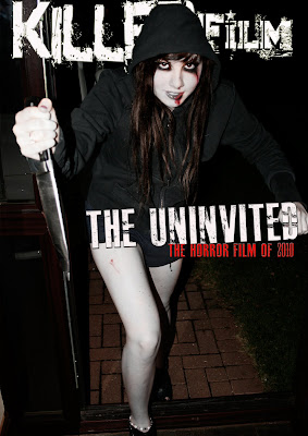
this is the basic outline of my magazine, i am yet to put the headlines surrounding the dominant image.


this is the basic outline of my magazine, i am yet to put the headlines surrounding the dominant image.
Tuesday, 19 October 2010
Logos that will be in trailer
I will use these to help structure the narrative in my trailer.
I am not going to place them straight after each other, there will be shots in between but this i will use this rather than using a voice over because i think it will be more effective for my type of trailer.
These are the shots I am going to be using in the order I will use them in.
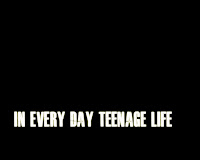
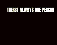
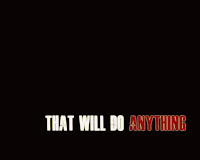
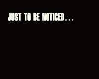
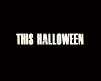
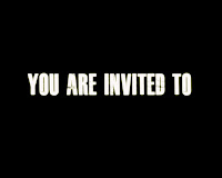
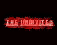
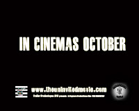
I staggered the narrative part because I am going to fade it in when i add it to my trailer so it will look unplanned and not quite shocking but unexpected to viewers which connotes the style of the film.
I am not going to place them straight after each other, there will be shots in between but this i will use this rather than using a voice over because i think it will be more effective for my type of trailer.
These are the shots I am going to be using in the order I will use them in.


I staggered the narrative part because I am going to fade it in when i add it to my trailer so it will look unplanned and not quite shocking but unexpected to viewers which connotes the style of the film.
Thursday, 14 October 2010
Creating film titles
I am creating film titles to go into not only my trailer, but to go on my poster. I want to create something that will clearly show that it is a horror film.
The text I have chosen is called "Ghetto Marquee", I chose it because it looked unusual and it is almost eroded and eerie itself.

I am going to use a black background, I decided this because it is very typical of horror/ slasher films and I think that it makes the text stand out more. It gives a more claustrophobic type of feeling to the logo, because it is dark.
This is the first draft of my logo.
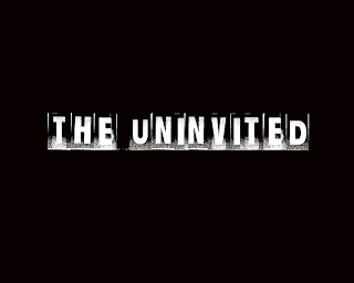
I asked some people what they thought of it and they said the text was good, but it looked too plain. I agreed that something was definatly missing to it.
I used different effects on the background such as lens flare, but playing with the lighting made it seem uneven and it made it look too light and i wanted it to be dark.
I tried to overlap the text with different brushes and I found a one that looked like blood had almost been splattered over the screen. I liked the effect it gave and here is the final film logo.
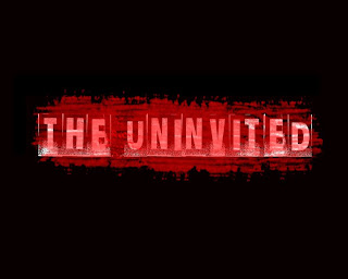
Once again i have slightly changed my film title design, using photoshop I added a glow to the text and slightly beveled the red effect over the top. This created a more realistic effect and I think it generally looks better.
Here is the final design.

The text I have chosen is called "Ghetto Marquee", I chose it because it looked unusual and it is almost eroded and eerie itself.

I am going to use a black background, I decided this because it is very typical of horror/ slasher films and I think that it makes the text stand out more. It gives a more claustrophobic type of feeling to the logo, because it is dark.
This is the first draft of my logo.

I asked some people what they thought of it and they said the text was good, but it looked too plain. I agreed that something was definatly missing to it.
I used different effects on the background such as lens flare, but playing with the lighting made it seem uneven and it made it look too light and i wanted it to be dark.
I tried to overlap the text with different brushes and I found a one that looked like blood had almost been splattered over the screen. I liked the effect it gave and here is the final film logo.

Once again i have slightly changed my film title design, using photoshop I added a glow to the text and slightly beveled the red effect over the top. This created a more realistic effect and I think it generally looks better.
Here is the final design.

Monday, 11 October 2010
Actors/actresses problems
I am in the progress of recording my trailer but due to my actors and actress's cancelling over the weekend of the 9th of october, i could not record the rest of my footage. Which puts me back one weekend over my action plan. To make up for lost time, instead of editing my trailer on the 11th October, i will create my poster.
Friday, 1 October 2010
New soundtrack/ problems with old soundtrack
Unfortunatley, we have just been informed that we can not use a copyright soundtrack wether we have been granted permission by the artist or record company or not. This causes a problem for me , because i am not familiar with using garage band and i do not have my own recording equiptment, I am going to use my friend, Jordan Paterson's music equiptment and recording gear to create a soundtrack that is perfect for my trailer. He has given me full permission and he is also going to briefly teach me how to use the equiptment.
New soundtrack
This is the soundtrack I have created using FL studio which is a software used to create music.
New soundtrack
This is the soundtrack I have created using FL studio which is a software used to create music.
Wednesday, 15 September 2010
Teesside University Skills Development Trip
On the 7Th of September we attended a skills development session at Teesside university to try and enhance our knowledge of using final cut express and our camera skills.
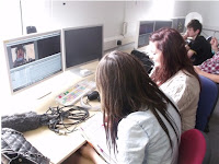
Using the cameras we went out and had approximately 20 minutes to record footage. We were taught how to use the cameras properly and shown some very important features on them. I learnt how important lighting is when recording something. We learnt how to adjust the iris on a camera. The iris is the piece that either lets more light in through the lens or filters it out. I also learnt how to adjust the white balance. If you do not adjust the white balance correctly to fit the conditions you are in, the colours may be slightly off. To make the colours normal you must find a white object in the room and zoom into it so the screen of the camera is framed over the white object and then you must adjust it. This is telling the camera what is white so it can detect the other colours and so it knows what they are.
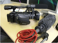
Another point i learnt was that to get full quality of your image/shots, you must zoom into an object far away and focus on it. Therefore everything around it will be focused too and the quality of the image will be better.
For sound, i learnt how to use a gun mic and why it is more reliable than just a normal microphone. The gun mic filters out the ambient sound so it can fully focus on more a specific sound, for example if you wanted to record footsteps you could focus the sound towards the feet whilst walking and the fluffy thing would filter out sounds.
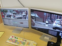
We also learnt how to use final cut express. We uploaded the footage onto the macs and played around with editing, transitions and sound. I learnt how to log and capture and incorperate different sounds. I also learnt how to add soundtrack and make it louder and quieter according the voice/ if i wanted any voice to be heard. We also used Clips from the film gladiator to produce a trailer/documentary about it. This helped improve and start my skills on final cut express considering i have never used it before.
Sunday, 12 September 2010
institutional logos
This is a prezi i created that looks at different institutional film logos i have looked at and how they inspired me to create my own.
Friday, 3 September 2010
Flat plans for Film poster
This is my flat plan for the film poster
i want the dominant image for this to be more a close up than a medium close up. This is just a rough sketch of it.
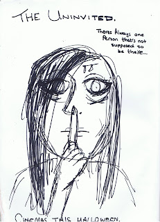
I want my poster to be simple yet effective. I will take sample shots of different lengths from the camera because I'm not sure if i want a medium close up or a close up yet. I have chosen a shot like this because it will literally make the viewer feel closer to the antagonist, which converts a sense of uncomfort but then a sense of curiosity. She also will look mysterious as her hair will be covering most of her face and her facial expressions will be the literal meaning of 'evil'. I want to a slogan because from studying other horror posters i have recognised that they use them and they help create more of a mystery towards the poster. The shot will be taken with a grey or black background, because if it was white it would be too light for the feeling i am trying to create. The pose she is pulling will be with her finger over her mouth, this creates a form of secrecy and makes the viewer want to see why she is 'hushing'.
The text for this will be white glowing because it will stand out because of the dark background and the fact that it is glowing will make it look spooky.
i want the dominant image for this to be more a close up than a medium close up. This is just a rough sketch of it.

I want my poster to be simple yet effective. I will take sample shots of different lengths from the camera because I'm not sure if i want a medium close up or a close up yet. I have chosen a shot like this because it will literally make the viewer feel closer to the antagonist, which converts a sense of uncomfort but then a sense of curiosity. She also will look mysterious as her hair will be covering most of her face and her facial expressions will be the literal meaning of 'evil'. I want to a slogan because from studying other horror posters i have recognised that they use them and they help create more of a mystery towards the poster. The shot will be taken with a grey or black background, because if it was white it would be too light for the feeling i am trying to create. The pose she is pulling will be with her finger over her mouth, this creates a form of secrecy and makes the viewer want to see why she is 'hushing'.
The text for this will be white glowing because it will stand out because of the dark background and the fact that it is glowing will make it look spooky.
Flat plans for Magazine
For the magazine I am going to use my antagonist in the trailer as the dominant image of the magazine, but i want to heavily edit it so it looks real but very scary. here is my flat plan for the magazine, this is just very breif but this is the idea.
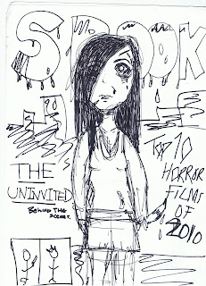
This flat plan is quite rough but it gives the basic idea of what i want to create mine to be like.
I wanted to make it more than any origional horror magazine because i thought that in modern times they seem very old fashioned so i came up with this to try and modernise it a bit making it actually look more scary.
For my dominant image i want a medium close up of my protagonist and i want her to look as though she has been murdering , so how she would look in the dis equilibrium of the trailer. The name of the magazine is spook because i wanted it to be obvious that it was a horror magazine and i thought it was a very typical word. Personally from researching other horror magazines i think they look very old and quite cheesy so i wanted to make mine look modern by looking at other film magazines and trying to add a futuristic feel to it. I will do this by using the photoshop skills i gained when i did AS media. The text for the magazine is going to be quite bold and i will make it look like blood is dripping from it and i will render the shading of the text to make it look different. I wanted to make the colours of the cover dark and i want to use a lot of greys in it. My model will be wearing dark messy clothes and her face will be mostly covered by hair.
The pictures around the magazine will be shots from the trailer, promoting the film even more. To make it look more real though, i will still put storys on the cover of other films but i want them to be a simelar genre to my trailer because then my magazine will apeal to people interested in horror/slasher.
Reece of location
I have chosen 3 places where i am going to film my trailer.
One will be here, which is an abandoned warehouse in the industrial estate near my house.
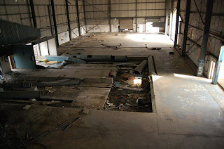
I have chosen this place because some of the scenery in it is broken and very scary looking, i will use this in my disequilibrium showing that some distruction has been made. I will record this when it is dark therefore i will have to set the camera so that we can still clearly see the characters. I think it is ideal because the natural feel of it, it feels spooky simply because of the fact it is abandoned.
Picture of living room
I have chosen this location because it is a typical looking household and i need the place for my trailer to look normal and this living room is definatly average looking.
woods
Some smaller shots will be taken place in these, to be shown as running shots, although they may not link in with the equilibrium they will be used to show the distortion of the film.
One will be here, which is an abandoned warehouse in the industrial estate near my house.

I have chosen this place because some of the scenery in it is broken and very scary looking, i will use this in my disequilibrium showing that some distruction has been made. I will record this when it is dark therefore i will have to set the camera so that we can still clearly see the characters. I think it is ideal because the natural feel of it, it feels spooky simply because of the fact it is abandoned.
Picture of living room
I have chosen this location because it is a typical looking household and i need the place for my trailer to look normal and this living room is definatly average looking.
woods
Some smaller shots will be taken place in these, to be shown as running shots, although they may not link in with the equilibrium they will be used to show the distortion of the film.
Music And permissions
I have chosen 2 tracks for my trailer both which i have asked for permission for, here are the 2 tracks uploaded from youtube.
This song was found on youtube by somoeone called 'codylq1' I think it is appropriate for my trailer soundtrack because it has a build up. It is quite repetetive which is good on a teaser trailer in my opinion because it doesnt have a positive or negative ending, it just keeps going. I could edit it so that the sound can increase or decrease to certain parts of the trailer so that i can create even more anxiety just through the sound.
This song is by a band called Bring me the horizon and i will contact their record company, Epitah Records, to try and get permission for this song. I may choose this track because I think that it could enhance the trailer but a down side to it is that its a very up tempo track so it will make the horror seem more like an action thriller or even a comedy.
The track that i found on youtube by 'codylq1' will go perfectly with my trailer. Because the creator of this song is not an official artist i decided to ask him via email on youtube. Here is the message i sent
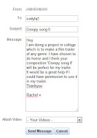
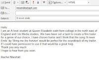
Here is the email i sent to Mirjam Millenaar who is the music licenscer of Epitah Records.
I have Chosen to use the first track by codylq1 because i think it is most suited to my type of film and the trailer.
This song was found on youtube by somoeone called 'codylq1' I think it is appropriate for my trailer soundtrack because it has a build up. It is quite repetetive which is good on a teaser trailer in my opinion because it doesnt have a positive or negative ending, it just keeps going. I could edit it so that the sound can increase or decrease to certain parts of the trailer so that i can create even more anxiety just through the sound.
This song is by a band called Bring me the horizon and i will contact their record company, Epitah Records, to try and get permission for this song. I may choose this track because I think that it could enhance the trailer but a down side to it is that its a very up tempo track so it will make the horror seem more like an action thriller or even a comedy.
The track that i found on youtube by 'codylq1' will go perfectly with my trailer. Because the creator of this song is not an official artist i decided to ask him via email on youtube. Here is the message i sent

Here is the email i sent to Mirjam Millenaar who is the music licenscer of Epitah Records.

I have Chosen to use the first track by codylq1 because i think it is most suited to my type of film and the trailer.
Story board
Shot by shot analysis.
scan pictures into scanner and discuss them , angles, shot disctsance etc.
scan pictures into scanner and discuss them , angles, shot disctsance etc.
Proposal of ideas
Genre- Horror.
Story Narrative
There is a girl classed as a typical 'popular' girl. She is having a party and inviting almost everyone except one girl who would be steriotypicaly classed as wierd. The popular protagonist has the party and then the antagonist watches over the party. After the party there is a sleepover and as the main protagonist hears a sound downstairs and goes downstairs to find the door wide open. She locks the door and when she enters the living room she finds ripped up invitations for the party and they are covered in blood. The girl is confused and when she enters another room in a panic the antagonist murders her. then the antagonist works her way up to the other girls including the smartest girl who could be classed as the final girl.
I will use generic horror iconography to do this, using a lot of dark saturation and deep colours such as red.
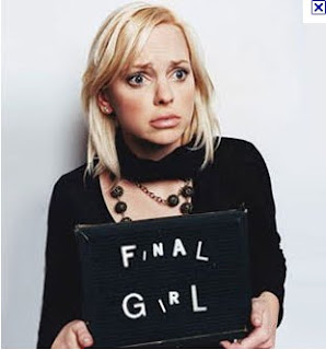
The final girl theory
I am planning to use 'the final girl' theory in my teaser trailer.
This theory is used commonly in modern horror films, It was discovered by Carol Clover who is a film professor. It states that there is usually a girl in a horror film who is in fact the last woman standing. This is usually in modern horror films because of the new era of women also known as post feminist women. These women are either just as strong or even stronger than the 'typical' man.
Some examples of films which incorporate 'the final girl' are films such as Saw II, the character Amanda, takes risks and she appears to be a kind and sincere character even though she is strong.
Usually in trailers of movies that have this element, even from the trailer we can sympathise for the protagonist, and we are shown parts of the equilibrium that help the audience to connect with her and then it shows parts that make us feel like we want to help her because she is in some danger.
I am going to incorporate something like this in my trailer because it will connect well to my narrative.

Friday, 25 June 2010
Secondary Audience Research
I have recorded a montage of shots of my friends as i ask them questions on a flip camera but the usb has broken on the camera, so i still have the card but i cant connect it to my computer so it has been sent away for repair and should be back soon. so for now i will just write the questions I asked and what i found out.
What is your gender?
4 females and 4 males
Do you enjoy horror movies?
All people said yes
What factors do you enjoy about them?
The feeling of anxiety whilst watching them, adrenaline. everyone said things like this.
What makes you want to go see a horror movie?
Alot of blood, mystery, on a trailer when there is a cliffhanger.
What is your favourite horror film?
Saw x2, Eden Lake, the grudge, i dont really have one, dead silence
Do you enjoy reading text on movie trailers?
yes but only on horros because it looks boring on other film trailers. voice overs are a bit more dramatic sometimes
Does the narrative have to be clear from the trailer?
We dont want to know the whole film, just little ideas about what its about, but the narrative has to be good.
I dont think so, i just like the effects and the gore to look good.
I have researched more into the age group i am aiming for and have found the type of tribes that would mostly enjoy the type of trailer i am looking to produce by researching in to tribes and different types of people.
Primary Audience Research
I have also recorded something for my primary research so i will do the same here and have the video on as soon as possible. i apologise for the inconvenience.
Trailer
Does this trailer make you want to go see the film?
Why do you find it interesting?
Why do you not find it interesting?
Which part of the trailer did you find the best?
Why?
Poster
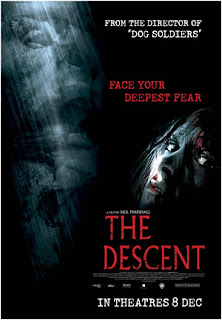
Does this poster make you want to watch the film?
Why?
Why not?
What is it about it that is interesting?
What age would you say it is aimed for?
Magazine cover
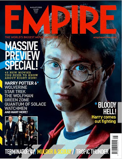
Do you want to buy this magazine?
What makes you want to buy it?
Do you firstly look at the image or the text?
If the shot was a longer shot do you think it would be as effective?
Why?
Trailer
Does this trailer make you want to go see the film?
Why do you find it interesting?
Why do you not find it interesting?
Which part of the trailer did you find the best?
Why?
Poster

Does this poster make you want to watch the film?
Why?
Why not?
What is it about it that is interesting?
What age would you say it is aimed for?
Magazine cover

Do you want to buy this magazine?
What makes you want to buy it?
Do you firstly look at the image or the text?
If the shot was a longer shot do you think it would be as effective?
Why?
Subscribe to:
Comments (Atom)


