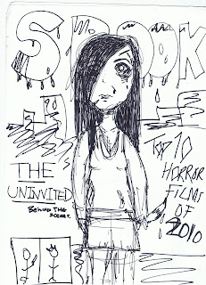
This flat plan is quite rough but it gives the basic idea of what i want to create mine to be like.
I wanted to make it more than any origional horror magazine because i thought that in modern times they seem very old fashioned so i came up with this to try and modernise it a bit making it actually look more scary.
For my dominant image i want a medium close up of my protagonist and i want her to look as though she has been murdering , so how she would look in the dis equilibrium of the trailer. The name of the magazine is spook because i wanted it to be obvious that it was a horror magazine and i thought it was a very typical word. Personally from researching other horror magazines i think they look very old and quite cheesy so i wanted to make mine look modern by looking at other film magazines and trying to add a futuristic feel to it. I will do this by using the photoshop skills i gained when i did AS media. The text for the magazine is going to be quite bold and i will make it look like blood is dripping from it and i will render the shading of the text to make it look different. I wanted to make the colours of the cover dark and i want to use a lot of greys in it. My model will be wearing dark messy clothes and her face will be mostly covered by hair.
The pictures around the magazine will be shots from the trailer, promoting the film even more. To make it look more real though, i will still put storys on the cover of other films but i want them to be a simelar genre to my trailer because then my magazine will apeal to people interested in horror/slasher.
No comments:
Post a Comment