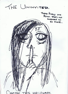
i want the dominant image for this to be more a close up than a medium close up. This is just a rough sketch of it.

I want my poster to be simple yet effective. I will take sample shots of different lengths from the camera because I'm not sure if i want a medium close up or a close up yet. I have chosen a shot like this because it will literally make the viewer feel closer to the antagonist, which converts a sense of uncomfort but then a sense of curiosity. She also will look mysterious as her hair will be covering most of her face and her facial expressions will be the literal meaning of 'evil'. I want to a slogan because from studying other horror posters i have recognised that they use them and they help create more of a mystery towards the poster. The shot will be taken with a grey or black background, because if it was white it would be too light for the feeling i am trying to create. The pose she is pulling will be with her finger over her mouth, this creates a form of secrecy and makes the viewer want to see why she is 'hushing'.
The text for this will be white glowing because it will stand out because of the dark background and the fact that it is glowing will make it look spooky.
No comments:
Post a Comment