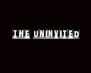
The text I have chosen is called "Ghetto Marquee", I chose it because it looked unusual and it is almost eroded and eerie itself.

I am going to use a black background, I decided this because it is very typical of horror/ slasher films and I think that it makes the text stand out more. It gives a more claustrophobic type of feeling to the logo, because it is dark.
This is the first draft of my logo.

I asked some people what they thought of it and they said the text was good, but it looked too plain. I agreed that something was definatly missing to it.
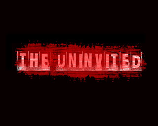
I used different effects on the background such as lens flare, but playing with the lighting made it seem uneven and it made it look too light and i wanted it to be dark.
I tried to overlap the text with different brushes and I found a one that looked like blood had almost been splattered over the screen. I liked the effect it gave and here is the final film logo.

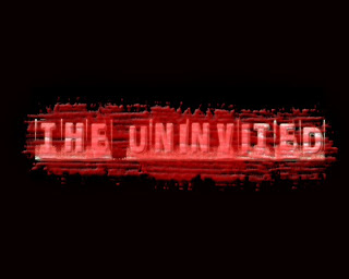
Once again i have slightly changed my film title design, using photoshop I added a glow to the text and slightly beveled the red effect over the top. This created a more realistic effect and I think it generally looks better.
Here is the final design.

No comments:
Post a Comment