Tuesday 16 November 2010

Magazine

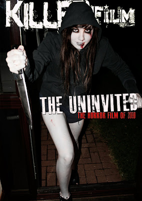
final magazine cover

Feedback
i think that the magazine relates well with my trailer and my poster but i am not convinced that it looks real enough to be an official magazine, the quality of it to me still looks cheap and tacky although i did want to make it more modern and realistic looking.
Poster

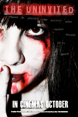
First poster draft
Feedback on Poster
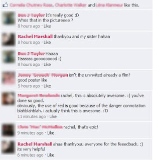
I posted my Poster onto facebook because i wanted to gain feedback for it and generally finding out weather it does look like a horror poster or not. The feedback i gained is positive therefore i am going to leave my poster as it is because i think it meets all the general elements of a generic horror poster.
Here is the feedback that I gained from facebook.

images for poster


These are the images i took for my poster, i wanted close up photos because ive noticed its generic of the horror genre and i like the intensity it creates.

Final trailer

Friday 5 November 2010

images for magazine

I have changed the name of my magazine from "SPOOK" to "Killer Film" i have done this because i think "spook" sounded tacky, and common whereas killer film is a bit more formal and i can use more effects with it.


this is the basic outline of my magazine, i am yet to put the headlines surrounding the dominant image.

Rough cuts